“I just need a logo and a website.”
The dreaded words we hear as web designers, graphic designers and branding professionals. Of course any business, organization or political candidate needs those things. So why all the fuss?
A logo and a website are also the last items in the process of defining your brand that should be considered in the creative process.
As designers, we often find ourselves with clients that ask for these things because that’s what they know as an attachment to a brand. It’s our job as creative professionals to educate our clients on why branding and brand identity are important things that need to be developed and created. A logo is just one piece of the puzzle.
Read on as we define what brand, brand identity and logo really mean in the marketing world.
What is a brand?
Let’s just get this out of the way. Your logo is not your brand.

Your brand is composed of ideas, impressions and experiences that your customers have about your organization, product or service.
Your brand can include the following:
- How people feel about your product or service
- How you conduct your business
- Who you do business with
- Pricing model
- Color scheme
- Font choices
- Messaging
- And of course your logo!
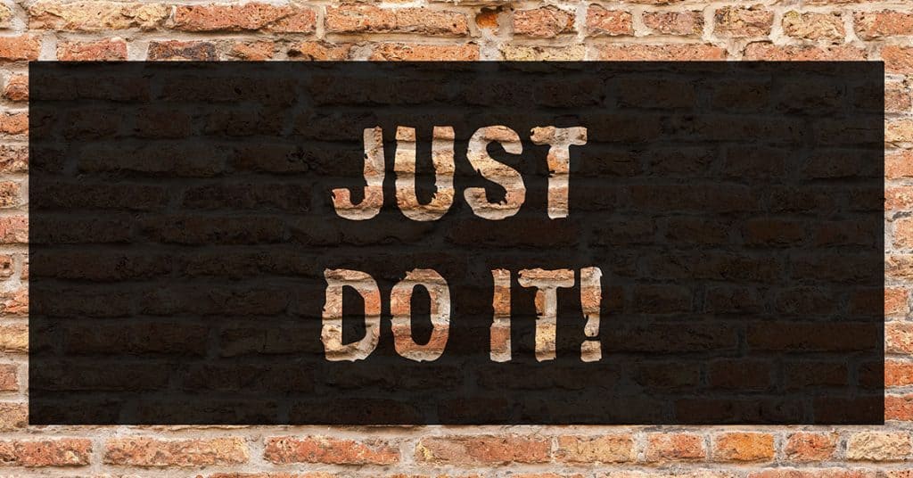
The campaign embodied Nike’s image as an innovative American icon associated with success through the combination of professional athletes and motivational slogans emphasizing sportsmanship and health. This led to customers associating their purchases with the prospect of achieving greatness.
The Just Do It trademark has been used throughout Nike’s marketing, on multiple platforms as a theme to help customers identify with the brand.
I have fond memories of lacing up a pair of Nike running shoes for my first cross-country season in junior high school right around the time the JDI campaign was launched.
The campaign left a lasting impression on me and I still purchase Nike products today for my fitness needs.

Nike’s products are at a price point I can afford. They perform well for the physical activities that keep me fit and make me feel good.
These are all things that contribute to their brand that inspires loyalty and trust.
Nike isn’t the only company that does this well. Think about Apple. Honda. Harley-Davidson. I’ll bet you’re picturing different things about those companies. The lifestyles, the sounds, and the feelings they inspire.
You’re probably also picturing the colors and logos that represent those companies.
Your brand identity starts with a collection of guidelines
A great brand doesn’t happen overnight. It’s built over time as your fame, reputation and success becomes known.
Until you’re a national household name, you need to start with the basics. Identifying a collection of fonts, colors, graphical elements and messaging that work together will serve as the foundation of your brand.
Your logo
Yes, we’re finally talking about it. It’s an important part of your branding.
Your logo is a mark. A block of text. A symbol.
It’s a graphic element that is easily and quickly recognizable as unique to you. Keep in mind, your logo doesn’t have to literally explain what your company does. It should symbolize a feeling or impression that your customers can connect to you.
Earlier, I shared the Just Do It message. I’m sure you immediately knew which company it belonged to. It’s a trademarked phrase that has been synonymous with the Nike brand for years now.
The same can be said for your logo. It will be visible nearly every time your customers interact with you. It will be used in your social media, your stationary, the side of your office building and your website.
The best advice here is to keep it simple. Details in your logo should be identifiable at it’s smallest size.
Your logo should fit into 1:1 and 16:9 proportions fairly easily. These are common dimensions used throughout the digital marketing world.
Find an appealing color scheme
The color scheme that you choose is just as important as your logo. Choosing a color scheme that resonates with your product or core values helps reach your intended audience.
HubSpot has a wonderful infographic about the psychology of color and has some interesting insights on which colors appeal to different demographics.
Choosing colors that are more appealing to the types of customers that purchase your products and services can lead to higher success.

Font selection
A branding item that is too often overlooked. Font selections usually come down to Serif, Sans Serif or Script. Typically, we like to use two fonts, especially for web design.
Alternating between a Serif and Sans Serif font for headings and body copy can help the user flow through an article down a page.
If you’re focused on physical products and have packaging considerations, script fonts can convey a happy and carefree feeling.
Definitely, do not under any circumstances use Comic Sans as your brand font. Unless, you’re running a lemonade stand.
Consistency
If you aren’t putting a consistent professional message forward, you aren’t building trust and loyalty with your customers.
The number one mistake that new businesses and organizations make is a lack of consistency. Color changes, inconsistent logo use and even different messaging can turn off people who are likely to be fans.
If your message isn’t consistent visually, it won’t be easily recognizable to your audience. Using the same fonts, the same color combinations and your logo consistently presents a professional image.
Presenting your brand in a consistent and professional manner helps to build trust and loyalty with your customers.
Setting up for success
No matter what the project is, we work to set baseline visual rules for every customer we work with. That includes developing a brand book to help them make their marketing and design easier and more consistent.
The brand book includes square and horizontal uses of the logo as well as color variations. We define brand colors, and acceptable contrasting uses. We also select fonts that resonate with the customers most likely to purchase their products.
The brand book is a collection of the visual elements that can be used to present similar looking marketing pieces that customers can begin to instantly recognize as belonging to the company that they belong to.
That’s the short version of a brand guidelines manual that meets the bare minimum requirements to get started. Branding can go as deep or shallow as you want. National brands spend millions annually on building their brand image. This also includes messaging, copywriting and tone of voice. Sign up for our newsletter to stay up to date, as we’ll be covering those principles in a future article!
If you want to know more about building a successful brand, reach out to us at info@onedog.solutions. We’d love to chat about how to help you grow.

Are you keeping your WordPress website protected?
Download our guide to understand how to evaluate the success of your website, plus tips that will help you make improvements today!
"*" indicates required fields
